Re-designing how users share costs : a Chippin case study
Helping people share the cost of an online purchase with friends & family in a simple and intuitive way
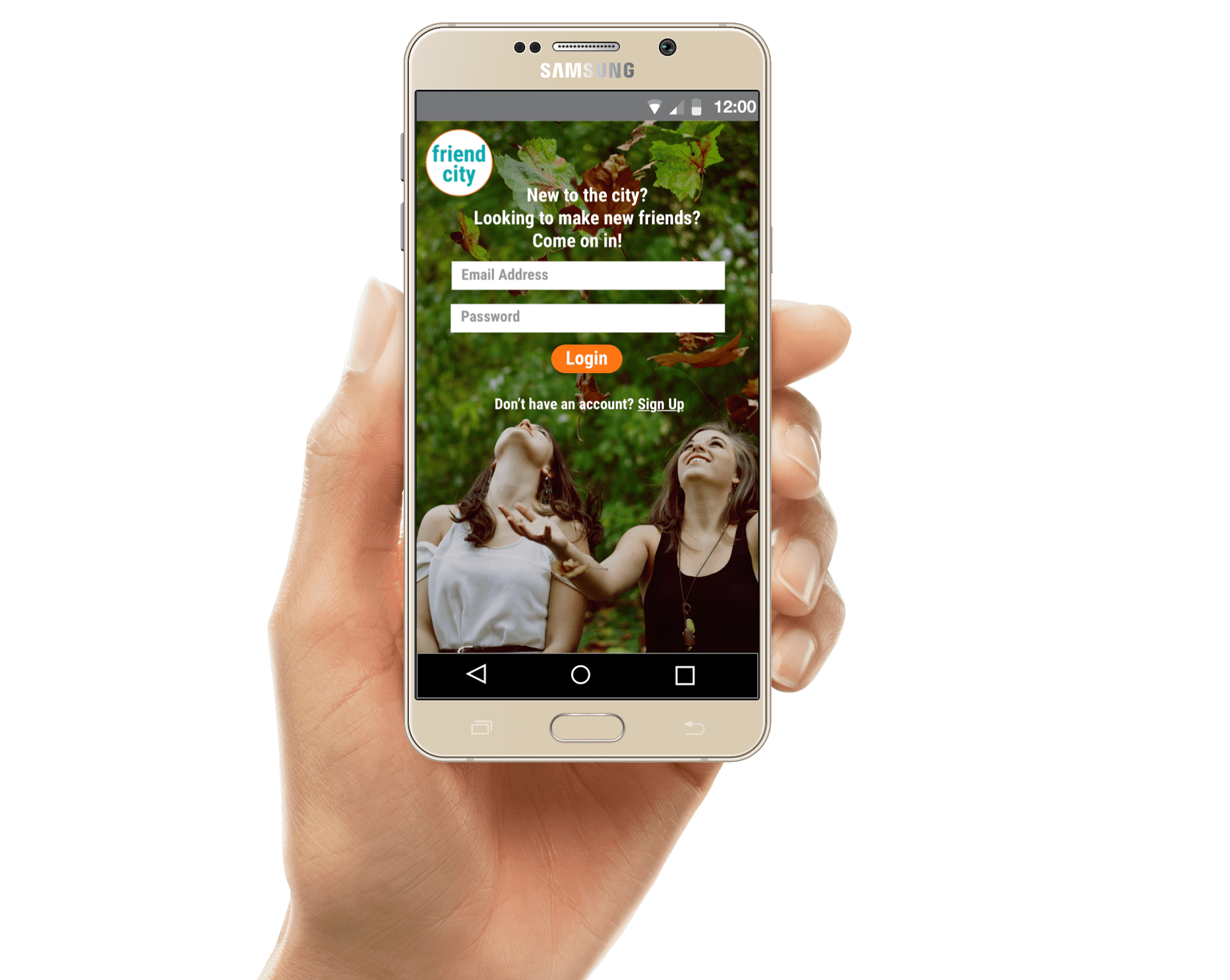
OVERVIEW
My team of three worked with a UK fintech company Chippin, who were looking for a simpler and more intuitive way to enable their customers to share the cost of an online purchase with friends & family.
Using agile UX methodology that encompassed contextual user testing and interviews, rapid paper prototyping and usability testing, digital wireframing and visual design, we built and delivered a final high-fidelity design prototype.
We received strong endorsement of our designs and UX process from Chippin’s CEO, COO and CTO, and our design is now on its way to being implemented.
DURATION:
2 week design sprint
MY ROLE:
- Project Coordination, Design Strategy & Wireframing, Usability Testing
- (Team of 3)
METHODOLOGY:
- User Research
- Contextual Enquiry & User Testing
- Client & Competitive Analysis
- Rapid Ideation & Wireframing
- Digital Prototyping (low- to high-fidelity)
- Preparation of Design Specifications
PROJECT GOAL
FOR CHIPPIN :
Chippin’s main objective was to prevent first-time users from dropping off or cancelling a purchase once they had been re-directed from the merchant’s checkout to Chippin’s landing page.
FOR US :
This meant a clear focus on reviewing the user journey on the Chippin site and make this as simple, informative and intuitive as possible.
And that’s what we did.
RESEARCH & DISCOVERY STAGE
We applied the fundamental principles of lean UX to work through the sprint and used the Double Diamond method to structure the process.
COMPETITIVE ANALYSIS
We began looking at some of Chippin’s competitors to get a broad understanding of the landscape, as well as specific insights into key players and their product features.
This included players in the traditional payments arena (payment gateways like Paypal), as well as in the shared transactions space (Splitit, Make it Social, etc)
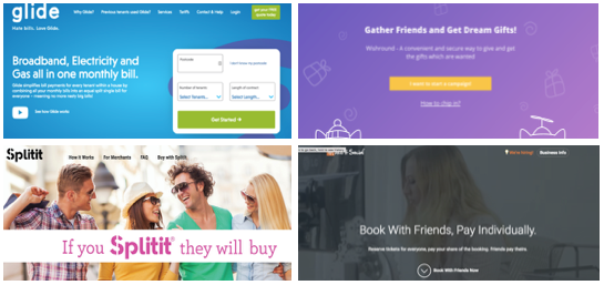
Key insights from this exercise were:
- Chippin’s proposition is unique in the marketplace — nobody else did exactly what Chippin was doing
- Competitor business models include fundraising, payment gateways and bill splitting
- Most competitors needed customer login — the fact that Chippin didn’t was a massive plus for Chippin users
CONTEXTUAL USER RESEARCH
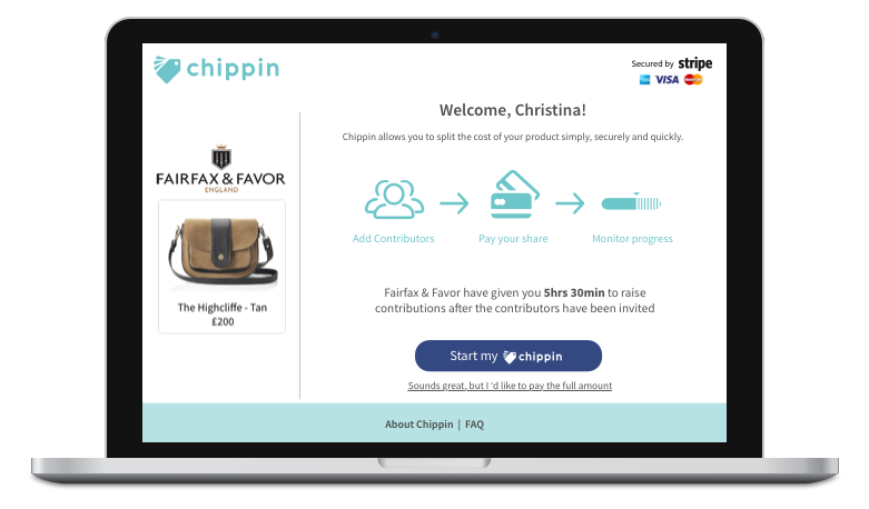
Once a user (the “Instigator”) clicked on the Chippin option on the merchant’s checkout page, they were re-directed to the Chippin landing page where they went through 3 steps:
- Add Contributors (who also chip in towards the cost of the purchase)
- Pay their share
- Track contributions
We began testing the current Chippin interface and user flow with many users particularly those who had experience of shared purchases. Most tended to be fairly young and tech-savvy.
As highlighted above, most felt that Chippin was solving for a very real customer problem and had a lot going for it, including just a few steps to complete the process and a trusted Stripe payment gateway (for those who knew what Stripe was!).
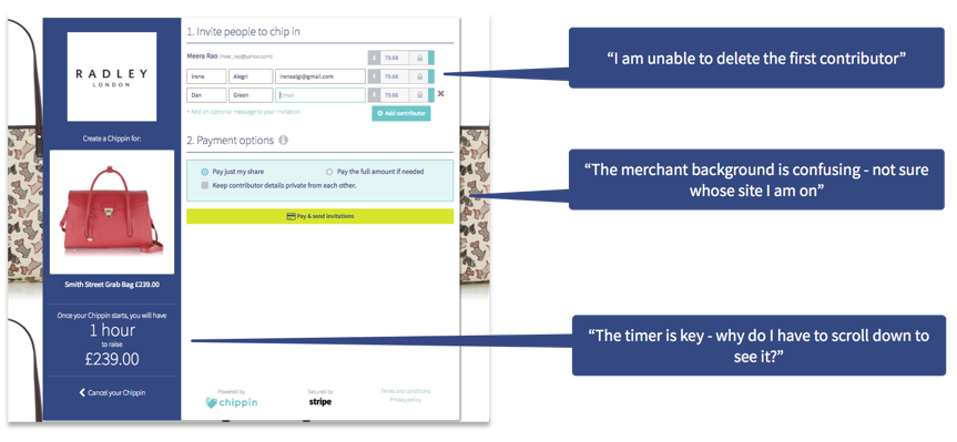
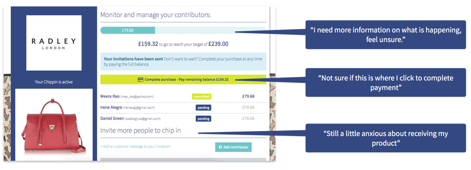
Digging deeper into the level of detail for a first-time user, the interface design, and overall usability, we unearthed lots of inconsistencies and frustrations that were getting in the way of the user journey.
MAPPING THE CURRENT USER JOURNEY
Mapping out the current user journey on an Experience Map highlighted the various steps in the process and the highs and pain points along the way.
An Experience Map captured this long arduous process perfectly.
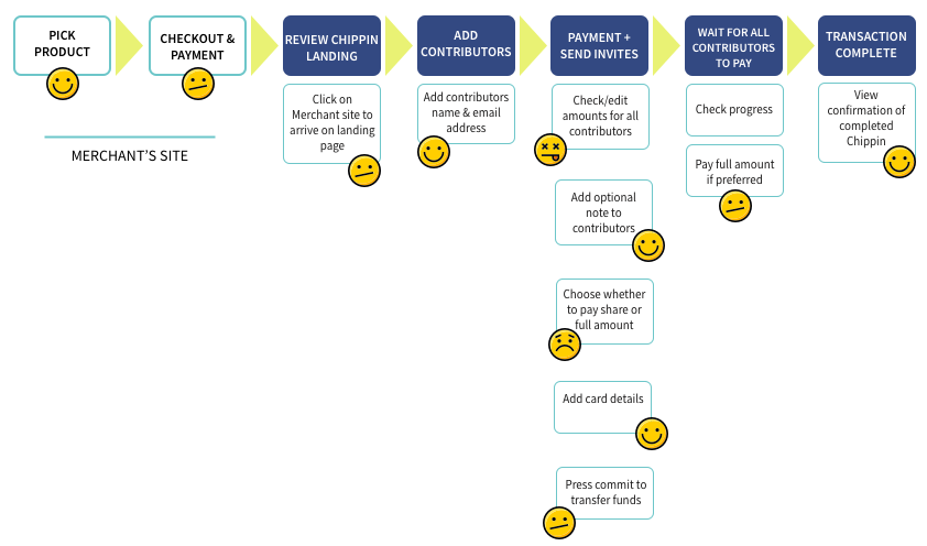
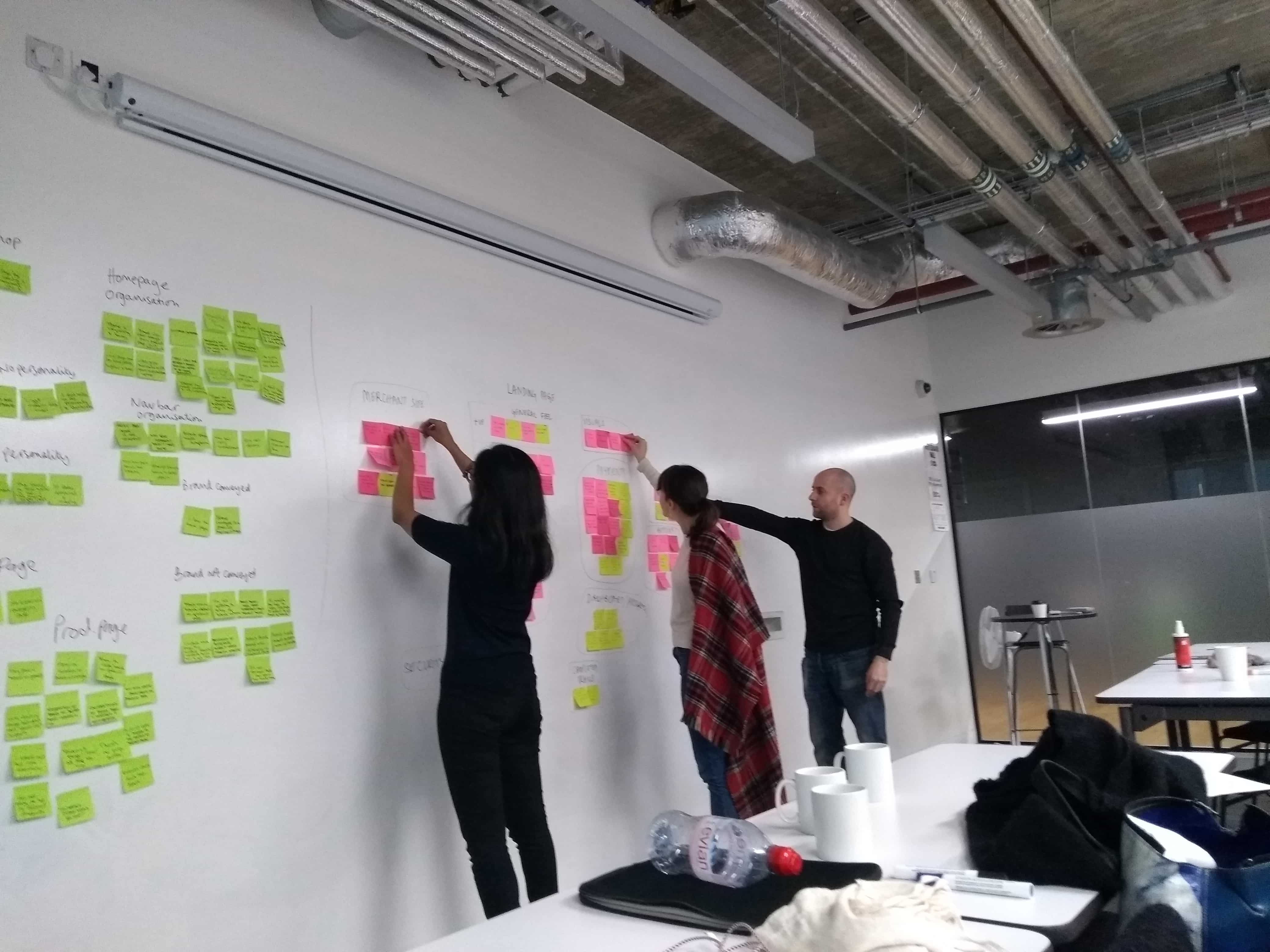
The combination of contextual user testing, mapping out the user journey and detailed user interviews gave us lots of great insights into Chippin’s current state, and specific areas that we could prioritise and address in our design stage. These were:
- User Education — ensure that the website offer enough detail to educate the user on the product’s benefits and what happens in different scenarios
- Visual Design — bring a visual consistency that enhances the brand messaging and doesn’t impede the transaction flow
- Website Layout — ensure that the various features, steps and details are laid out in the right way
- Perception of Security — being fundamentally a payment option for an online purchase, the website needs to communicate this security and feeling of trust
DEFINING & IDEATING
PERSONAS
Using the user research, we created 2 user personas that incorporated our user interview findings and reflected our interviewees’ goals and frustrations.
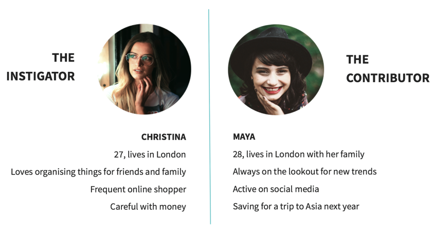
We felt that looking at the user flow primarily from the instigator’s point of view would enable us to more comprehensively cover the Chippin journey and for this reason we decided to focus on Christina.
As Christina’s persona was drawn from actual user research, it enabled our team to ensure that all design decisions were were user-centric.
CHRISTINA'S SCENARIO :
It was now time to establish a scenario for Christina that we would design the solution for and test against in our usability testing phase.
Christina’s best friend Michelle is moving to Australia and she is buying her a beautiful handbag from Fairfax & Favor as a farewell present with three other friends: Maya, Jane and Tony. At the merchant checkout, she notices the Chippin option for splitting the transaction cost online and clicks on this.
DEVELOPING THE SOLUTION
IDEATION - DESIGN STUDIO
We kicked off the design development phase with a design studio that we ran with the Chippin founding team.
The objective of this exhaustive session was to find ways to build user education & trust.
With a clear problem to solve, the rapid group brainstorming session generated lots of quick and interesting ideas on screen formats and ways to educate and reassure the user.
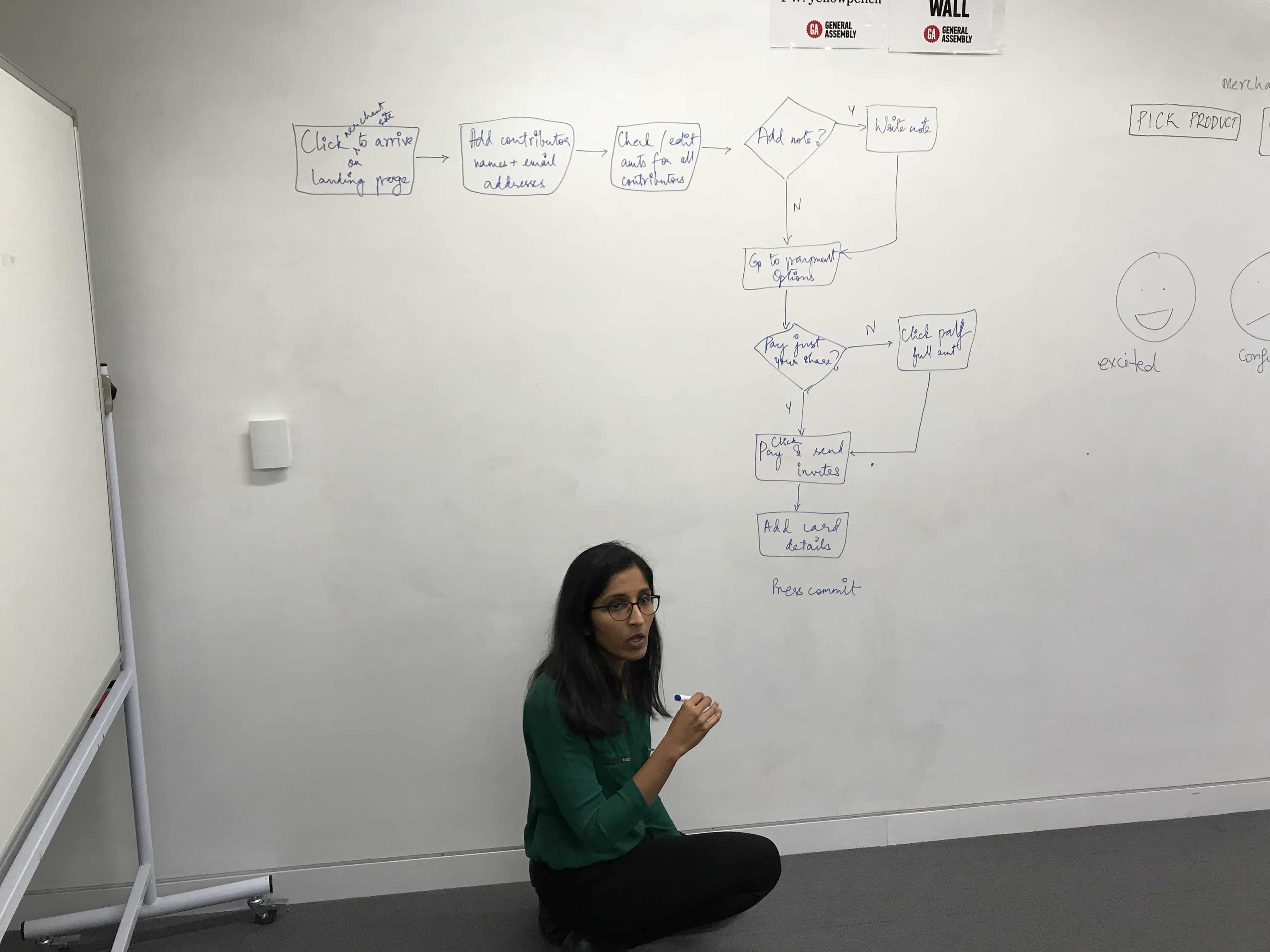
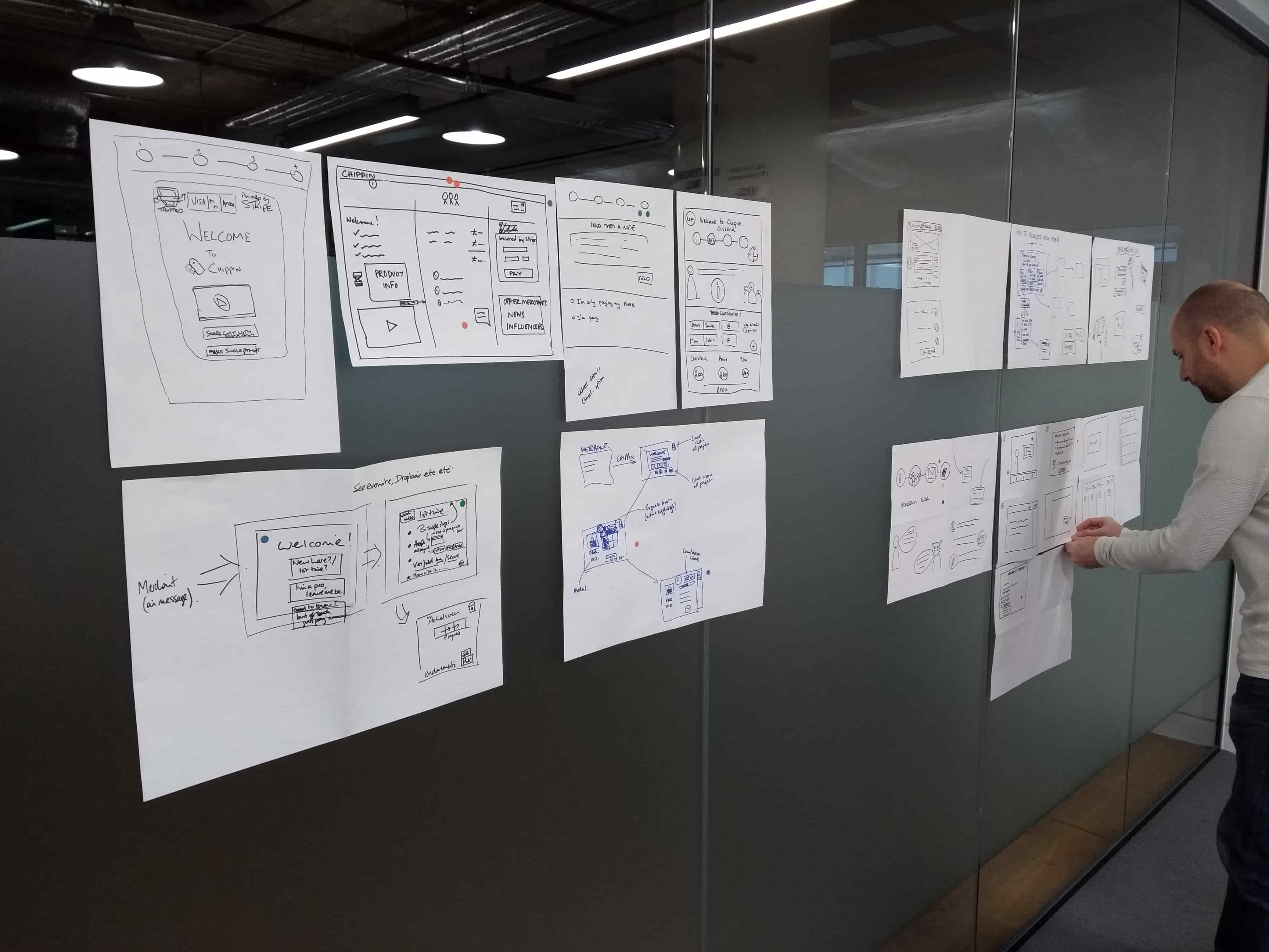
DESIGN ITERATIONS - PAPER PROTOTYPES
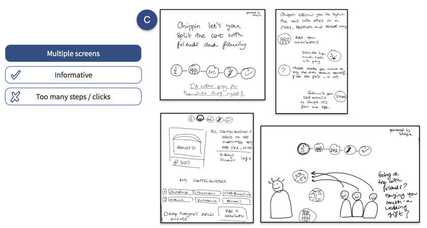
We generated lots of paper prototypes on screen formats that had varying levels of information and detail.
We tried to find the right balance between having a simple and stripped-back layout (which users equated to secure payments) vs screens with more comprehensive information (which users also asked for as this was a new product with many what-if scenarios on timing and contributors).
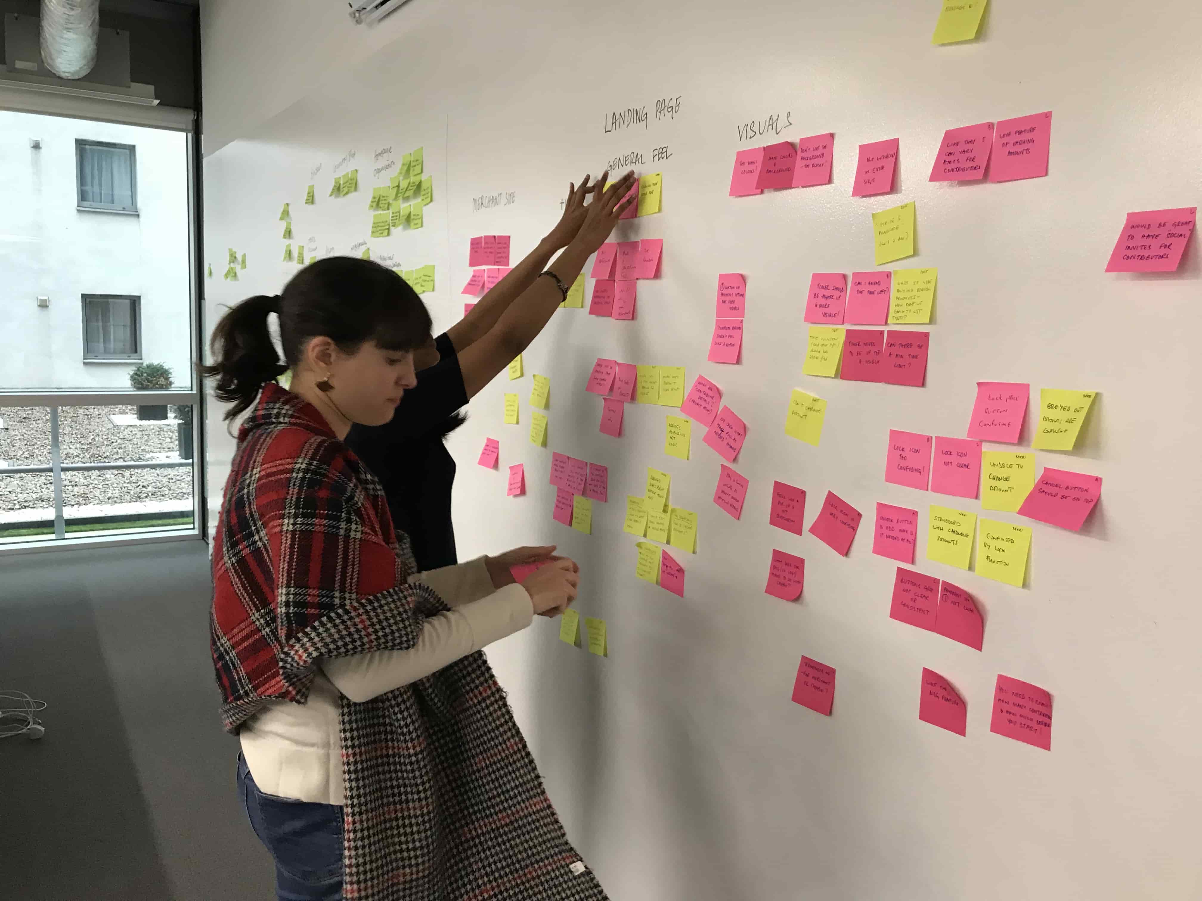
Not arriving at a consensus, we did what we always do — ASK THE USERS.
We A/B/C tested the prototypes with around 7–8 users and analysed the findings.
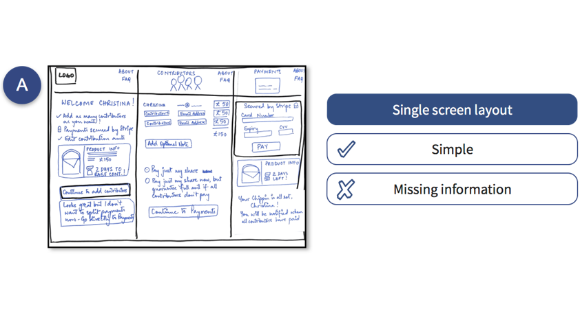
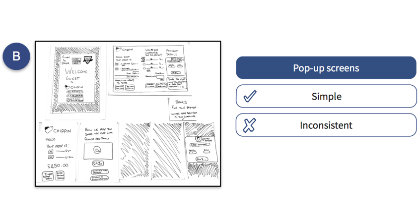
While many users liked the format A for its simplicity, they felt there was a lot of detail still missing around product information, time limits on raising contributions and payments.
Format C was comprehensive and engaging but had too many steps, while format B was confusing in its page layout.
We incorporated the feedback from these tests to arrive at the right screen formats as we moved to the digital prototyping stage.
DESIGN ITERATIONS - DIGITAL PROTOTYPING
As a result of all the research, prototyping, testing and iterations, we broke the user into 4 specific screen designs. For each of these, we moved through various iterations while upping the fidelity and testing constantly.
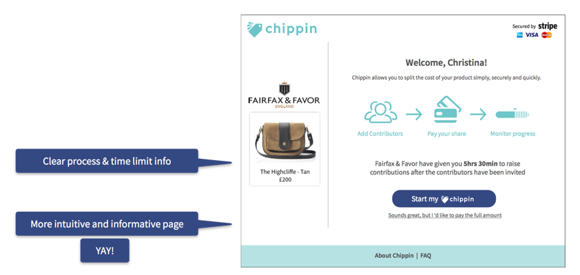
SCREEN 1 - WELCOME / LANDING PAGE
Iteration 1
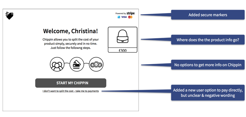
Iteration 2
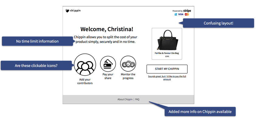
Iteration 3
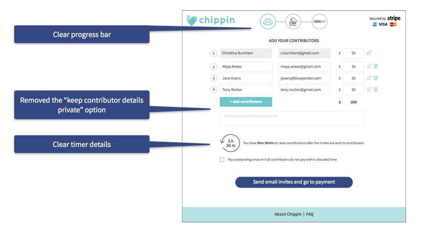
SCREEN 2 - ADD CONTRIBUTORS PAGE
Iteration 1
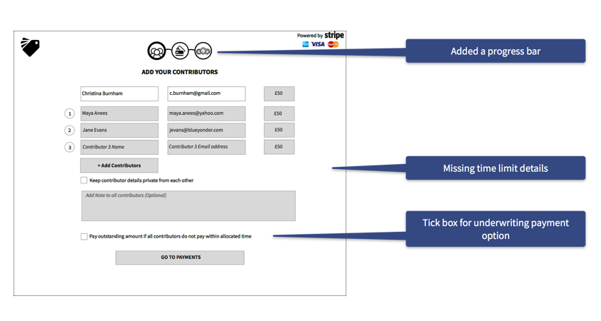
Iteration 2
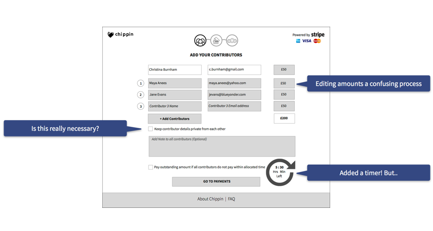
Iteration 3
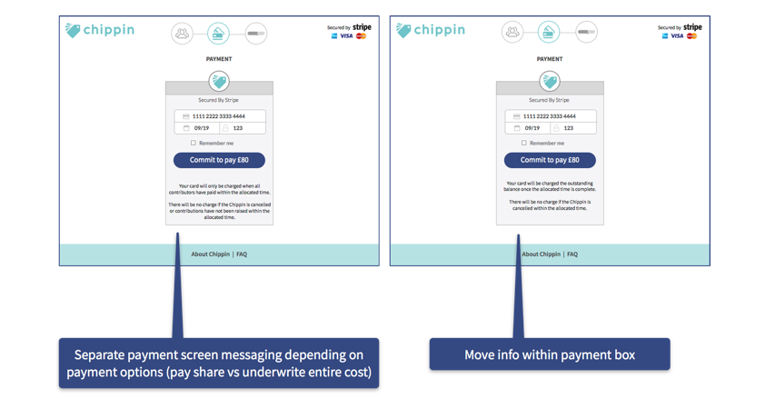
SCREEN 3 - PAYMENTS PAGE
Iteration 1
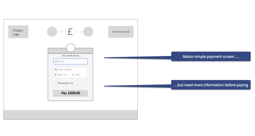
Iteration 2
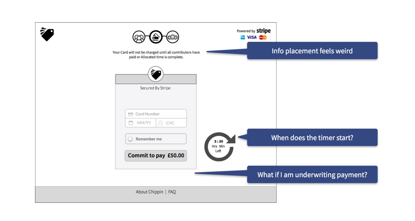
Iteration 3
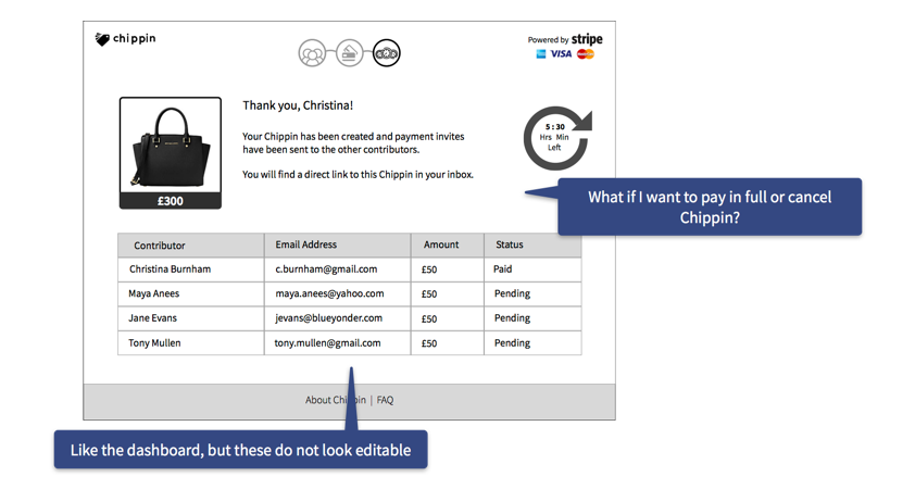
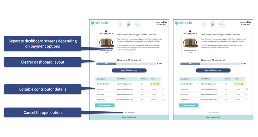
SCREEN 4 - DASHBOARD PAGE
Iteration 1
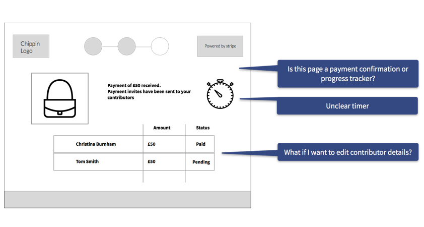
Iteration 2
EXTRA, EXTRA
By this stage, the user feedback had gotten vastly better, and was so positive that I felt we could push the boat out a little further in the design sprint by:
- Reviewing the designs at the secondary persona user flow (the Contributor)
- Re-designing the content of the emails sent to the instigator and contributors to ensure these were consistent with the new designs.
REFLECTIONS
Both the user feedback through the project, and the feedback from the Chippin management team on the re-design project has been wonderful, and extremely rewarding.
Working within the constraints of a 2 week design sprint, we achieved the objectives of the project brief, and more.
We presented our designs and workflows to the Chippin CEO, CTO and COO, and their feedback was incredibly positive. The Chippin team is now in the process of implementing our designs.
"You have all clearly put so much time, thought, energy and, dare I say it, love and passion into helping to move Chippin onto the next level in terms of UX/ UI, and we massively appreciate it."
— Toby Rhodes, Chippin COO
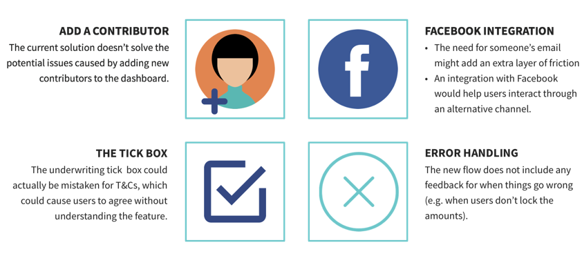
IF WE HAD MORE TIME....
Given more time, and based on user feedback through the course of the project, there are additional areas we could have explored:
"Great concept! I hate chasing people for money"
"I like that it has just a few steps!"